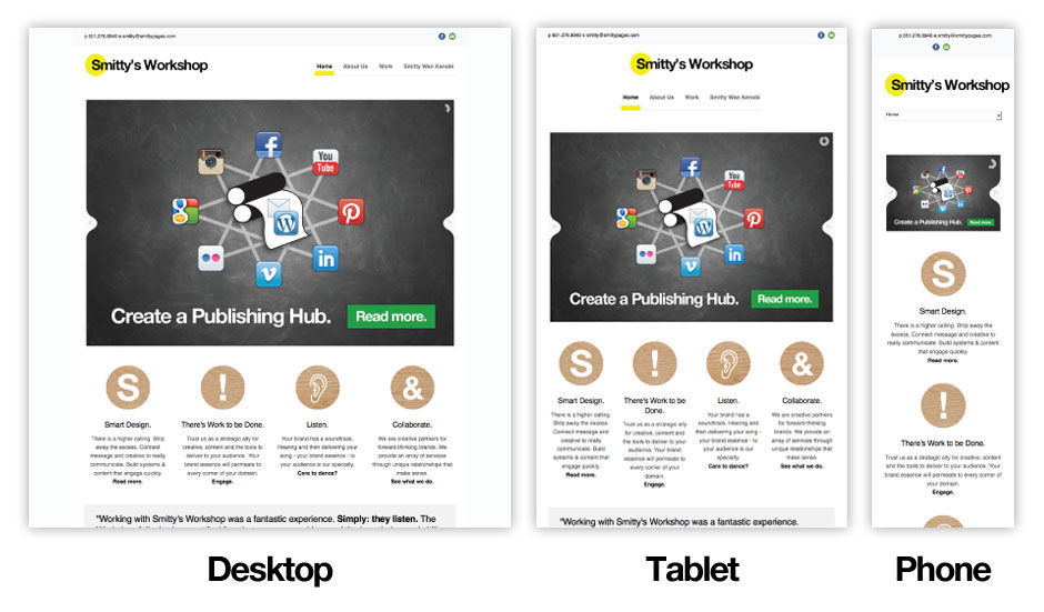
Responsive Web Design
When you view your website on a smartphone does it look like you’re viewing it from 10 ft. away? Do you need to two-finger-zoom to see your content? Are your fingers just too big to click through your navigation?
Sounds like your site needs a responsive overhaul.
Responsive web design is the art of building web pages that automatically detect the size of your browsing device and adjust your content accordingly. Images and text columns re-size on-the-fly. Navigation switches position and/or style to work better on mobile screens. Whole sections of content move down below – or hide altogether – so that no zooming is required. Simply scroll through smartly styled content.
Smittypages.com is built on a responsive WordPress base theme (Goodlayers’ stellar Maxima theme) that uses media queries to detect changes in your browser window width. If you’re viewing on a desktop web browser, go ahead, re-size your browser window…shrink it down and you will see how the site automatically adjusts to the width of your browser window. The site applies different cascading style sheet (CSS) rules for different browser widths.
Now, maybe you’re thinking…Can’t I just create a mobile version of my site that is specifically formatted for mobile devices? Yep. You certainly can. But, chances are you might need to edit and update two different websites any time you make changes to your site. A responsive site serves up the same rich content for every device – it just sizes and organizes appropriately.
When building a site for mobile viewing you’ve got some options:
- Ignore mobile devices because your audience doesn’t use mobile devices (!?)
- Build a separate mobile version of your site, and edit each version whenever you make changes
- Go responsive. Provide an intuitive and smart layout for your site on all devices, and edit your content just once.
> Find out how you can create a web publishing hub for your enterprise.


